UI should feel effortless, even when the solution is complex. This is where we bridge the gap between wireframes and reality – making everything work seamlessly.

Bringing order to your screens
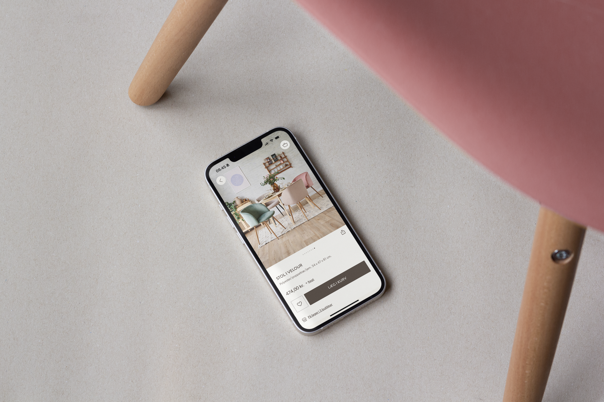
At Vertica, we approach UI as the bridge between strategy, design, and technology. We ensure that everything—from navigation and product cards to filters and checkout—is built on a solid visual foundation, impacting both carts and KPIs.
We understand that many e-commerce solutions are complex, with numerous user scenarios, stakeholders, and elements that need to work seamlessly across platforms. That’s why we base our design on robust design systems, ensuring consistency across all platforms and devices.
Good UI ensures:
- Consistency throughout the customer journey
- Faster time-to-market for new features
- Fewer errors in handover to development
- Your brand comes to life in every corner of your solution

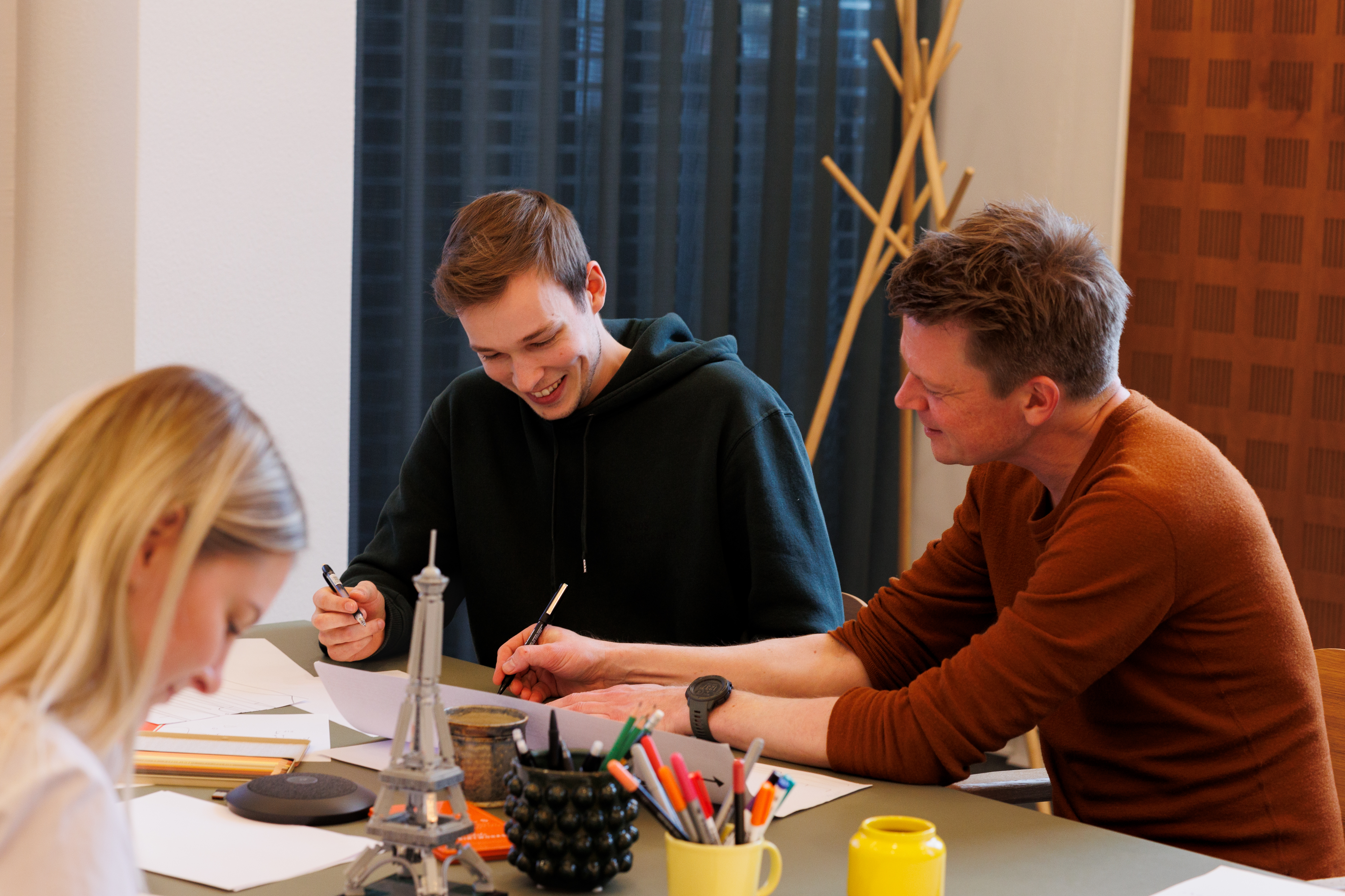
Bridging business and frontend
UI bridges UX, design, business, and development. It fills the gaps and ensures that the visual vision aligns with technical specifications.
In e-commerce, this means constantly balancing conversion optimisation with visual identity, technical requirements, and flexibility. We excel at creating structure and systems so that all parts of the solution work together, like a top team in a world championship.
Once the fundamentals are in place, we create space for what truly elevates the experience. Knowing the boundaries allows us to focus on the details that deliver recognition, delight, and quality in every single interaction.

Less clutter, more flow
Good UI tidies things up. It makes complex flows easy to navigate and reduces friction in the buying journey. We work with clear visual hierarchies, documented components, and well-considered stages to make the user journey as smooth as possible—whether it’s a first visit or a third repeat order.
Proven security
When we design, we document. Every component, every functional state, every variation is recorded and updated, so your team can always find what they need. No more digging through old sketches or confusing Figma links.
This creates confidence—both internally and when the solution is developed, expanded, or handed over. We cover all scenarios, resulting in fewer setbacks in development, less duplicate work, and stronger collaboration across teams.


UI Design & Business Development